
In their paper, Elena Pagliarini et al. describe an elegant experiment in which a group of two hundred and ninety eight Italian school children wrote the word burle (jokes) ten times at different speeds and sizes using a wireless pen and graphics tablet. The children, between the ages of six and ten, and all of them students in grades one to five, were asked to write the word in big and small sizes, at slow and fast speeds, and also spontaneously. The researchers investigated the rhythmic organization of the children’s writing by measuring whether the same proportion of time was spent on each letter regardless of total duration, or whether writing speed was proportionate to the word length under different conditions.
It was found that the children maintained the same relative letter duration across fast, big, and spontaneous writing conditions from grades two to five, with a minor deviation in grade one. The same ratio of letter to word duration was found across all the grades. The researchers conclude that these properties are inherent, rather than acquired developmentally, and are possibly innate. “[D]espite being a cultural invention,” they write, “handwriting fits perfectly the constraints of our biological architecture.”1
Handwritten Letters
Unlike speech, handwriting is not a natural creation and has always been dependent on particular technologies. Figure 1 compares the word burle written in upper and lowercase letters by a fourth grade Italian girl with my own handwriting. My examples were written with a ballpoint pen, or biro; the young girl used a wireless pen and an Intuos Wacom 3 graphics tablet. The wireless pen has similar line-width characteristics to a biro.2 In the study by Elena Pagliarini et al., these letterforms are termed all-capital block script, and cursive script.3
Figure 1.
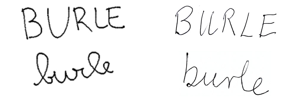
Shown on the left is the handwriting of a nine-year-old Italian girl. My own handwriting is shown on the right.
Modern capitals, often treated as the ideal form of letters and used for formal purposes, are derived from the serif Roman capital letters that can be seen inscribed on monuments such as Trajan’s Column. Capitals are rectangular, their width varying between broader letters, such as < G M O >, and narrower letters such as < B E P >.4 When capitalized, <BURLE> has one wide letter, <U>, and four narrow letters, < B R L E >. Roman capitals, as Andrew Haslam has noted, can be divided into three types: round, such as < O >, symmetrical, < A >, and non-symmetrical, < P >.5 All the letters of the word <BURLE> are non-symmetrical.
Each letter in <BURLE> involves one or more strokes, a line produced without lifting the pen. In the child’s writing, <E> has three strokes, < B R > two strokes, and < U L >, one stroke. In my own writing, <E> has four strokes, < B R > two strokes, and < U L >, a single stroke. Children are taught to make strokes in a particular sequence. My <E> has a vertical line followed by three horizontal lines, while the child’s has a downward vertical stroke ending in a curve followed by two horizontals. Chinese calligraphy, by way of contrast, reverses this order—horizontal strokes before vertical.
First brought together in Italy during the late fifteenth century, lowercase and capital letters originate in two quite separate historical traditions for inscriptions and handwriting. “The two alphabets of roman,” Jan Tschichold claimed, “are really two different styles.”6 Eric Gill went further, asserting that “Roman capitals, lower-case and italics are three different alphabets.”7 It is difficult to discern a resemblance between many pairs of capital and lowercase letters. Consider <A/a>, <G/g>, and <E/e>. Lowercase letters often possess ascenders above the main letter height, as in < b d f k h l t >, and descenders below the baseline, as in < p g j q >. Written in lower case, <burle> has two letters with ascenders, < b l >, but none with a descender.
Cursive letters are made with a single continuous pen movement.8 Handwriting experts do not, in fact, recommend joining all the letters. “Pen lifts,” Rosemary Sassoon counsels, “must be allowed during longer words, otherwise this combination of the pen and the way we write will strain the muscles of the hand and eventually distort the letters.”9 Letters may be joined from either the top or the base. The child’s <b> and <u> are joined at the top, while mine are linked from the base. Conversely, her <r> and <l> are linked from the base, while mine are linked at the top.10 The construction of her looping <b> with an open bowl at the base, and made in a counterclockwise direction, is quite different from my straight line <b> written clockwise with a closed bowl.
The experiment described by Pagliarini et al. is focused on the word burle. No reason is given for its selection beyond the fact that “it is usually written in a smooth, continuous line when writing in cursive script.”11 The frequency of its usage in childhood Italian is not mentioned. If rhythmic effects extend across words, then a more comprehensive study would require more words with different syllabic structures.12
The word burle comprises just five letters. The five capitals are not a representative sample; there are no round or symmetrical letters; and the lowercase letters do not have descenders. The cursive versions test only four links between letters.13 That the initial <b> of burle dominates the other four letters on both measures may, in fact, be due to its word-initial position, or to some other characteristic of the letter <b> itself.
Letters and Language
Letters are a study in contrast: <b> is not <p> or <d>, so <bad>, <pad>, and <dad> are three different words. The original Roman alphabet was adapted to specific languages, with slightly different consequences for, say, Italian, Swedish, and Turkish. Writing systems may share the Roman alphabet, but the written inventory of letters varies from one language to another. Italian has twenty-one main letters, with five letters < j k w x y > available for loan words such as taxi.14 A child learning Italian handwriting is thus faced with a slightly different task from another child learning English handwriting.
Written letters have systematic relationships to spoken sounds. Written in English, <bad> corresponds to the spoken /bæd/, and in Italian <burle> corresponds to /burle/. Alphabets connect the written language with the distinctive sounds of the language, the phonemes.15 English has around forty-four phonemes and makes up for the shortfall in letters by combining them. Thus <th> acts like a single letter corresponding to both th sounds: the voiced <this> /ðɪs/ and the unvoiced <thesis> /θi:sɪs/. Standard Italian has about twenty-five phonemes, but still resorts to letter combinations: <ch> corresponds to /k/ when followed by <e/i> in chiesa.16
Both Carol and Noam Chomsky have argued for lexical spelling that represents the underlying phonological form rather than the sounds of actual speech.17 In many languages such as English, some words are processed as whole written units. The words know, colonel, and Leicester are examples. As they grow older, Italian children rely more and more on words understood as single units.18
Alphabetical writing systems are tied to the phonology of the language. The letter <z> is the same in Italian and English, but the sibilant /z/ in English is rather different from the affricate /dz/ in Italian. Syllables underlie the rhythm of sentences. Spoken syllables are formed around a vowel (V) as a nucleus. Onsets and codas, possessing a variable number of consonants (C), precede and follow the nucleus. The Italian burle corresponds to two syllables CVC-CV. If burle were an English word, it would most likely correspond to a single syllable CVC, assuming that the final <e> is silent.
Languages are considered to be either syllable-timed or stress-timed. In languages such as Italian each syllable has roughly the same duration. In a stress-timed language, stressed syllables occur at regular intervals and unstressed syllables are shortened or lengthened to fit the underlying beat. This difference has been ascribed to the “time occupied by vowels in the speech stream” and “the duration of consonantal intervals.”19 Italian has a higher proportion of speech time for vowels than English. The fact that burle has two syllables in Italian may also affect its spoken rhythm and may indirectly affect the rhythm of its writing.
Can conclusions based on the writing system for one language be generalized to other systems? The forms of the letters appearing in the study are, in part, specific to Italian, and the phonemes and syllables are Italian as well. The proportion of vowel time distinguishes Italian from other languages such as English. Italian is transparent in the sense that its written and spoken forms are the same. English is opaque: tough but dough. Nonetheless, the researchers conclude: “Handwriting appears to be characterized by an inherent rhythmic structure.”20 This conclusion could be phrased more cautiously in terms of Italian children, rather than children in general.
How might the rhythm discussed in the experiment relate to rhythm as it is discussed by linguists? It may be a general property of muscular movement, shared by macaques, as the authors point out, or it may be something specific to language production, whether spoken or written.
The Teaching of Letters
Spoken language is acquired by children from the language they hear. Writing is taught. Evidence from spoken language can reveal the natural, partially innate development of language in children, but evidence from written language is always seen through the lens of how the child has been taught to read and write.
Figure 2 includes stand-alone lowercase print letters and joined-up letters with both an entrance and an exit, such as the <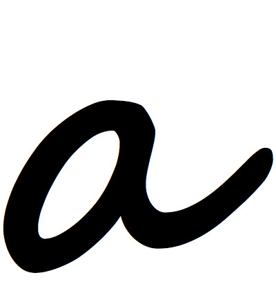 > in <
 >. According to Pagliarini et al., the Italian children were taught capitals before cursive letters. The UK national curriculum advises that children “should be taught to write with a joined style as soon as they can form letters securely with the correct orientation.”21
Figure 2.

Versions of the letter <a>: first three from left, Segoe typefaces; next three, my handwriting.
A problem faced by teachers is the changeover from one type of letter to another. Going from capital < > to cursive <
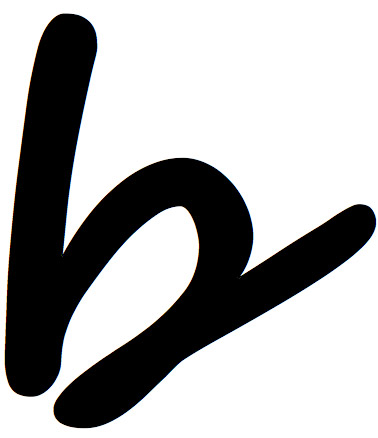 > is a leap, as can be seen from the child’s examples in Figure 1. In the UK, the wisdom of jumping from print to joined-up has been challenged by those that feel children should make joined-up letters from the start.22 This involves unlearning one way of making letters.23 My own print <
 >, for example, was clearly made with two strokes, unlike the single stroke in the joined-up version. The Italian children were not a random sample, but had undergone a specific teacher-determined progression. They were drawn only from “schools that introduce the training of cursive script during the second semester of the first grade.” Whether Italian children are still taught to write on squared paper rather than lined is also relevant, as this may have an impact on size.24
The precise wording of the instructions given to the Italian school children is not provided. It is important that the same terms used by their teachers were employed. In English, asking the children to write big letters would be problematic, since for many this would be synonymous with capital letters rather than large letters. Nor do we know how the children were presented with the word burle, other than that there was no template—it may have been dictated by the researchers. In that case, the children would have needed to know the correspondence between sounds and letters. It may have been presented in a context, as often happens in dictation tasks, or as an isolated word.25
To what extent are the results due to the way that the children were taught handwriting, in particular the sequence in which they learned letter forms? The rhythm found by the researchers may be an artifact of a particular teaching approach rather than “an inherent aspect of motor-planning during handwriting,” and so may not generalize to children taught in other ways.

 >. Thanks to Bene Bassetti for noticing this.